More recognizable coloring of armor

Locked
User avatar
Lostmixup
Donor
Donor
Posts: 1020
Joined: 20 May 2015, 16:25
Location: Cloud 9

More recognizable coloring of armor

Post by Lostmixup » 07 Aug 2015, 23:11

Summary (a quick, 2-3 sentence summary):
So I've been having the issue on alpha of not being able to tell who's in what squad at first glance, or at all by just looking at them. I feel this is a major problem that leads to confusion in the long run. I suggest we make the coloring on marine armor more distinct and recognizable.

Benefits (How this will benefit the server and game as a whole):
Will allow squad members to find each other more easily in the field generally causing less confusion allowing squad members to stick together better.

Details (Description of how you think this would work, the benefits, etc):
I suggest covering the armor with more color than is already on it or making the armor colors more stand out-ish (make alpha a brighter red, bravo a less pale yellow, charlie a more bright purple, etc).

I also suggest adding a recognizable colored symbol onto the armor (possibly only on the helmet, or on both) that would change color depending on what squad the persons in. To make it even more recognizable you can make the symbol change depending on what squad the person is in. This symbol could simply be the first letter of the squad they're in or an actual symbol, depending on how much effort anyone would wanna put into it.

Not everyone is on a monitor that's above 15" nowadays, so not everyone will have the sprites scaled up large enough to see the colors as they are currently. Making the colors more distinct on the armor will alleviate this problem.

EDIT: Here's an example photo of a bunch of marines all together mixed up and such.
Image
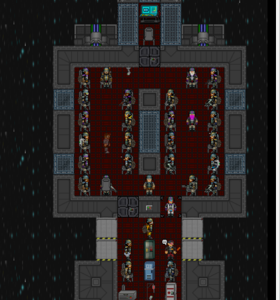
It's a tad confusing if I do say so myself.
Last edited by Lostmixup on 08 Aug 2015, 00:10, edited 1 time in total.
Default Scrolly Blur

User avatar
Densane
Registered user
Posts: 27
Joined: 03 Aug 2015, 23:28

Re: More recognizable coloring of armor

Post by Densane » 07 Aug 2015, 23:47

Personally, I find the current armor to be enough, if far too much. The garish colors detract from the "Military armor" feel of things.

... your not mildly color blind are you?
Image

User avatar
Lostmixup
Donor
Donor
Posts: 1020
Joined: 20 May 2015, 16:25
Location: Cloud 9

Re: More recognizable coloring of armor

Post by Lostmixup » 07 Aug 2015, 23:48

Densane wrote:Personally, I find the current armor to be enough, if far too much. The garish colors detract from the "Military armor" feel of things.

... your not mildly color blind are you?
Nah, I'm on a laptop 100% of the time, and SS13 doesn't look awesome on it's small screen. The colors usually look washed out and generally hard to distinguish, mainly on the body armor.

Also, there doesn't have to be more color, the colors just have to be more recognizable at a glance in my opinion. It's either that or give all squads their own armor designs, and I'm pretty sure the dev team doesn't wanna do that.

EDIT: Here's an image of what it looks like on my screen, it's not to hard to tell the difference when everyone is still, but when like 50 marines are in one area frantically running around it can get pretty hard to tell who's with who, ESPECIALLY if they don't have a helmet on.

Image
Default Scrolly Blur

User avatar
Densane
Registered user
Posts: 27
Joined: 03 Aug 2015, 23:28

Re: More recognizable coloring of armor

Post by Densane » 07 Aug 2015, 23:56

I think I know your problem. I've recently found that Byond has a hardware based anti-aliasing that makes everything look "Fuzzy" because it blends pixle's color values a bit in order to smooth over everything. I can't see predators cloaking outline at ALL because the anti-aliasing blends everything together completely.

If you have that anti-aliasing turned on (which it is by default iirc) as well as working on a small screen, I wouldn't be surprised if they muddled the whole thing completely.

this may be completely anecdotal, and maybe a bit unrelated, but hey, it's something.

I DO agree on one thing though: The basic armor and military belt has red on it, which makes my brain jump through a loop for just a millisecond when I first glance at someone. But sometimes that millisecond is what counts. That should be fixed.

And maybe Delta needs to be touched up a bit, yeah. The helmet is pretty bad.
Last edited by Densane on 07 Aug 2015, 23:58, edited 1 time in total.
Image

User avatar
LordeKilly
Registered user
Posts: 806
Joined: 24 Feb 2015, 16:55
Location: mongoria
Byond: lordekilly

Re: More recognizable coloring of armor

Post by LordeKilly » 07 Aug 2015, 23:58

I'd like brighter colors, or distinct patterns, the delta blue literally melts into the armor.
Image

User avatar
Lostmixup
Donor
Donor
Posts: 1020
Joined: 20 May 2015, 16:25
Location: Cloud 9

Re: More recognizable coloring of armor

Post by Lostmixup » 08 Aug 2015, 00:01

Densane wrote:I think I know your problem. I've recently found that Byond has a hardware based anti-aliasing that makes everything look "Fuzzy" because it blends pixle's color values a bit in order to smooth over everything. I can't see predators cloaking outline at ALL because the anti-aliasing blends everything together completely.

If you have that anti-aliasing turned on (which it is by default iirc) as well as working on a small screen, I wouldn't be surprised if they muddled the whole thing completely.

this may be completely anecdotal, and maybe a bit unrelated, but hey, it's something.

I DO agree on one thing though: The basic armor and military belt has red on it, which makes my brain jump through a loop for just a millisecond when I first glance at someone. But sometimes that millisecond is what counts. That should be fixed.

And maybe Delta needs to be touched up a bit, yeah. The helmet is pretty bad.
Also you mentioned color blind people earlier, that's a really good point! We should make sure color blind people can tell the difference too.
Default Scrolly Blur

User avatar
Jeser
Registered user
Posts: 1119
Joined: 04 Mar 2015, 00:47
Location: Donetsk, Ukraine

Re: More recognizable coloring of armor

Post by Jeser » 08 Aug 2015, 01:06

LordeKilly wrote:I'd like brighter colors, or distinct patterns, the delta blue literally melts into the armor.
I agree, Alpha and Charlie is normal now. But Bravo and esspecially Delta is awfull.
Jeser "Fox" Aushwitz.
Jeser believes only in one thing - common sense.

Image
Image
Apop's permission: Click

Killing Torcher
Registered user
Posts: 2
Joined: 06 Aug 2015, 11:04

Re: More recognizable coloring of armor

Post by Killing Torcher » 08 Aug 2015, 01:12

As Jeser said, Bravo and Delta are really in desperate need of repainting.

Locked